Have you ever seen the Clickable Elements Too Close Together error on your google webmaster dashboard? This is a very common error but you must take care of such things to rank well on search engines like Google.
I have got many personal messages and emails regarding the solution to this error, so I m writing this article to help every webmaster solve this issue with ease.
Throughout this article, I will provide you with the exact steps to solve the Clickable Elements Too Close Together error, but before heading towards this, let me introduce you to this error.
What exactly “Clickable elements too close together” error mean?
Clickable Elements Too Close Together Error is a common error that can occur when creating a website. This error can occur when two or more elements are placed too close together on a page, making it difficult for users to click on the desired element. This can cause problems for users, especially those with smaller screens or touchscreens. To fix this error, webmasters need to ensure that there is enough space between clickable elements on their websites. I will provide step by step guide to do so later in the article.
Also Check: How To Fix LCP Issue: Longer Than 4s (Desktop) and (Mobile)
Why Does Google show the “Clickable elements too close together” error?
Since Google is the leading search engine on the internet, it always focuses on providing the audience with the most relevant result as well as a good user experience. It uses an algorithm called Mobile-first search algorithm which means you should design your site’s user interface keeping the mobile users in your mind.
Google displays the “Clickable elements too close together” error when it finds that clickable elements on your page are too close together. This can make it difficult for users to accurately click on the element they want and can result in a poor user experience. Google recommends that you space your clickable elements further apart to avoid this issue.
Also check: Complete Technical SEO Audit Checklist For Beginners
How To Fix Clickable Elements Too Close Together Error?
Follow this step-by-step process to fix your Clickable Elements Too Close Together Error.
Identify the affected URLs
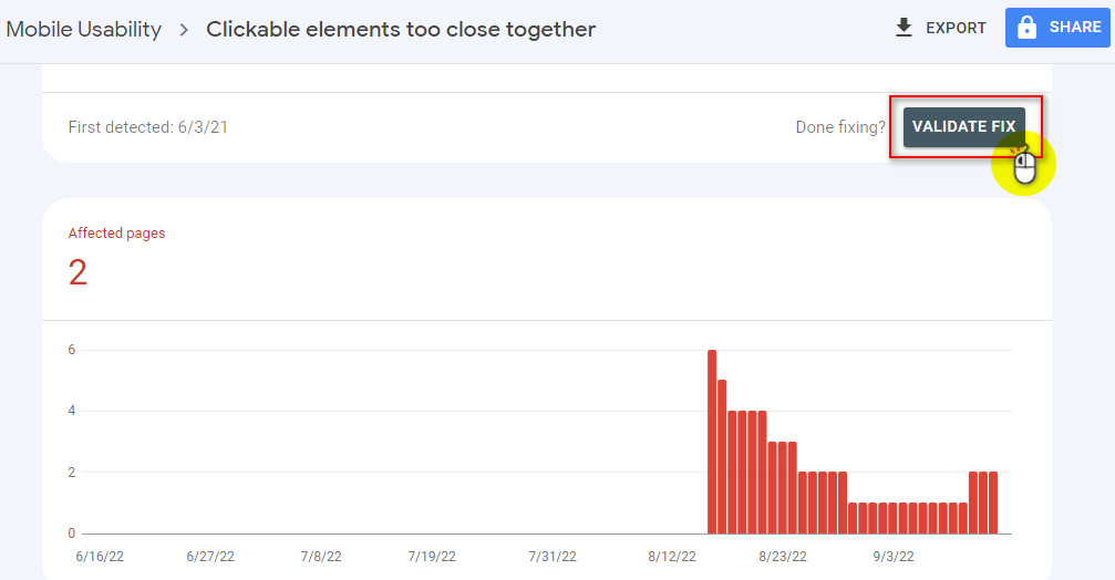
The first step to fixing this issue is to find the pages that are having this issue. To do so, Go to the google search console and navigate to the Mobile Usability section. If you are really getting this issue, you will see the error message like in the picture below.
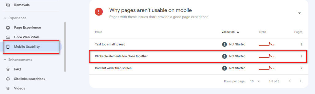
In my case, there are two pages suffering from this problem. Now click on it and you will see a list of URLs having Clickable Elements Too Close Together Error.
You May Also Like: How To Fix Crawled – Currently Not Indexed Issue?
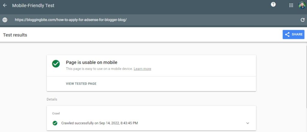
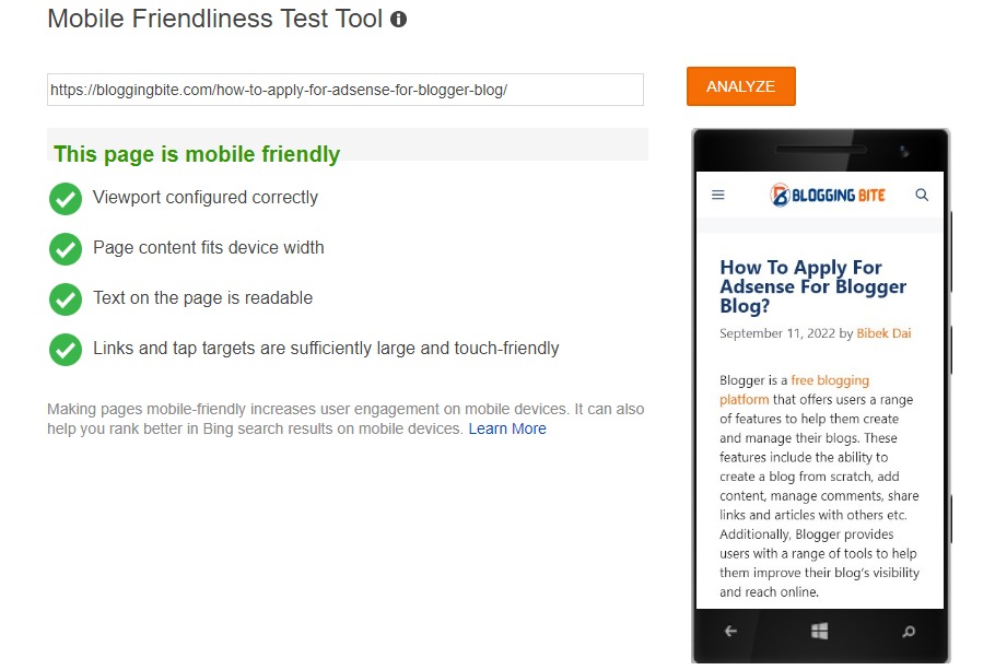
Go through Mobile friendly test
Next, Copy the URL you have got in the previous step and perform the mobile-friendly test. To do this, you can use either Google Mobile-Friendly Test Tool or Bing – Mobile Friendliness Test Tool. I recommend here to test your page using both tools since both of them may return different results. It’s quite confusing but you don’t need to worry about it as we will examine it to the coding level.
Set the Touch Target Size at Least 48 px
A mobile touch target is an area on a touch screen that a user can press to activate an element. The size of the target should be large enough so that it can easily be activated by a finger or thumb, but not so large that it interferes with other elements on the screen.
To solve the Clickable Elements Too Close Together issue, make sure to set the tappable targets on mobile devices to a minimum of 48px so that it can be easily tapped by users. This is especially important for links and buttons, which should be easily tappable so that users can easily navigate your site or app.
48px is the minimum size for tappable targets, but you can make them even bigger if you want. Just make sure that they’re big enough for users to accurately tap on.
Configure Mobile Viewport tag
Another way to fix the Clickable Elements Too Close Together issue is to set up the mobile viewport tag. It’s compulsory to have a proper mobile viewport tag set on your website to ensure that your content will be rendered correctly on mobile devices.
The mobile viewport tag is an HTML element that is used to control the size and scale of the viewport. It is used to make sure that the content of the webpage is rendered correctly on a smaller screen. Use the following tag to fix your mobile viewport tag:
meta name=”viewport” content=”width=device-width, initial-scale=1″
The above code will force the web browser to match the size of the viewport, with the size of the user’s screen. As a result, your web page will turn responsive as well as mobile-friendly and most probably it will fix the Clickable Elements Too Close Together error.
Test The Changes
After you have done every possible change, make sure to run Google mobile-friendly test as well as Bing mobile-friendly test and make sure that you have fixed the error.
Validate Fix
Finally, you have fixed the Clickable Elements Too Close Together error. Now again go to the Mobile Usability section in your Google search console dashboard, and click on Validate fix button up-right. Then within a few days, Google will validate it and you will see the “Passed” message. Which means you have done it 100% correctly.
Related: How To Fix Discovered – Currently Not Indexed Issue?
Summary
“Clickable elements too close together” is very common but must fix errors in order to get ranked on search engine result page as well as to provide a good user experience.
As the number of people using mobile devices to access the internet continues to grow, it is important for every webmaster to have their website mobile-responsive. A mobile responsive website will adapt to the screen size of the device it is being viewed on, providing an optimal experience for the user. It can help to improve the user experience and Search engine optimization, which can lead to more traffic to the website.